
Are you bleeding? You’re not? Well you should be. And by the end of this article, you will be. Welcome to the post!
What in the name of Sam Hill are you talking about?
One of the first things we have to do when someone comes to us with a project for the first time is work out what level of understanding they have of the print process. That way we can offer the appropriate amount of support to get them from on screen to in print. The quickest way to gauge, we’ve found, is to ask them to explain the concept of bleed to us in under 100 words.
And oh my, the responses we get… Ask us about it some time. Preferably after a con when you’ve just bought us a drink.
The correct answer is this:
A bleed is a small extension of the working canvas used by printers to allow for minor inconsistencies when trimming pages to size. Typically 3mm on each side, the bleed should be an extension of whatever is at the trimline. (40 words #winning)
Clear as mud, right?
So when we print you comics (or anything really) we’re printing them all on the same size sheets of paper. For short runs on the digital press that’s SRA3 (just over A3). So if you have an A5 comic we can fit 2 spreads on there, a US comic (260x170mm) will get a spread to a sheet, ditto A4, and so on and so on. We’re not loading pre-cut pages into the machine, because that would be a tremendous waste of time and resources. Instead we fill the sheet with as much print as we can fit on there and trim to the appropriate size afterwards.
Following me so far? Time for an experiment:
Go grab 5 sheets of A4 paper, draw a line half a millimetre thick in exactly the same place on them all, stack ’em up and shuffle them across the table at about 30 miles an hour while hitting the line precisely each time with a very sharp blade. How’d it go? Not so good? Congratulations, you just discovered the point of a bleed! Obviously our operation is a bit more sophisticated than a guy wildly swinging a machete at bits of paper (because life isn’t fair), but even with a fully automated & digitised system we’re still talking about hitting a precise point hundreds of times in a row on a moving target. By allowing 3mm of leeway either side of the trim line we ensure that you don’t get nasty white borders where you’re not expecting them, or cutting into a speech bubble or something.
What does this mean for me?
Depends, really. If you have white borders then it means diddly squat to you – have a nice day. If you have a background of any sort (explosions! superhero fights! a solid block of colour!) it means that you need to be working to a canvas size 6mm wider and taller than your print size, in the knowledge that 3mm will be taken off every side. The rule of thumb is that if it touches the edge of the page, it needs to bleed.
With comic printing this can be especially tricksy, since you’re drawing from scratch. You don’t want to find out at the point of printing that you need to do comprehensive re-draws just to cover something that nobody’s ever going to see anyway! The good news is that 3mm on each side is an industry standard – there are a few who work with less (because it allows them to get more on a sheet, and thus maximise their profit), but you don’t want to be working with them really – there’s a reason everyone else asks for 3mm, and it’s because that’s what’s needed by pretty much every press ever built.
So there you go – when sketching out your book make sure you’ve allowed an extra 3mm on each side of each canvas to allow for bleed. You’re a winner! Oh, also worth noting that the tolerance requirement is on both sides of the trimline. Don’t be putting anything crucial within 3mm of your desired page edge either.
99% of the time any printer worth their salt will hit the trimline exactly (we typically run an extra 10% of the print run to allow for any mistakes to be caught and chucked out). At the same time, we can’t do quality checks on every copy of everything we print, so sometimes things will sneak through – if you’ve got your bleeds right it won’t matter!
How to set up your bleeds in InDesign.
A lot of folks will use InDesign for final layout of their books. Which is a good idea, because it’s a very useful bit of software for quickly creating a high quality PDF. It’s also got two places where you can lose your bleeds, even if you’ve set them up right, which is annoying. Here’s what you need to do:
1. When setting up your document you’ll be presented with a screen like this:
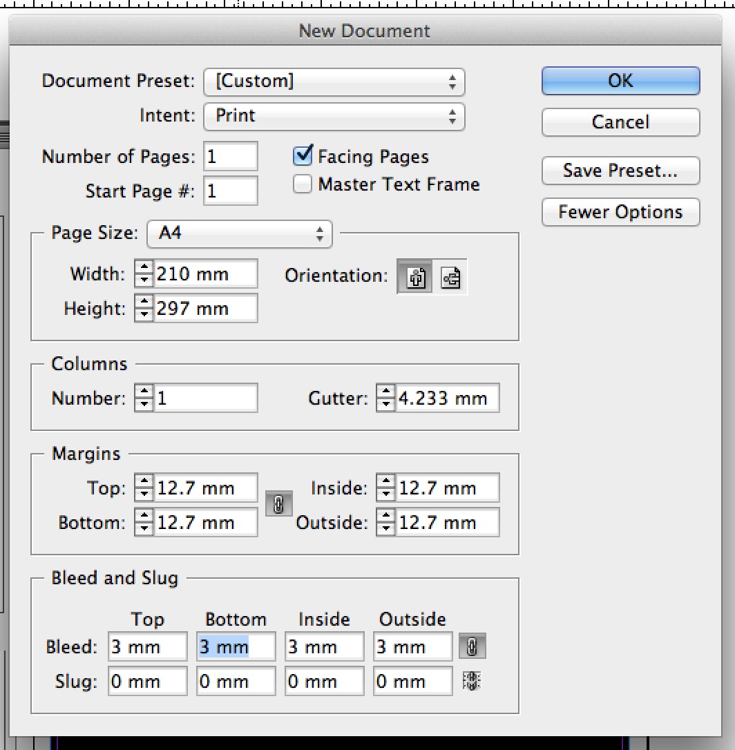
See the bit at the bottom? “Bleed and Slug”? That’s the first place you need to be letting ID know about your bleeds. If you can’t see it you need to hit the button in the top right saying “More Options” (it says “Fewer Options” in my screenshot because I’ve already got them showing, obviously.) Make sure that you’ve got 3mm in all of these fields. Ignore Slug entirely – you have no use for it.
A blank document with bleeds will look like this:

That thin red line is your bleed line. The more substantial black line is the trim line. I’ll say it once more: if something touches the black line, it needs to reach the red line too.
So you’ve got your bleeds all set up in the document. Time to PDF this thing and get it to print, right? Right. But careful when doing it because…
2. InDesign’s PDF presets usually don’t account for document bleed settings. Goodness knows why, but there you go…
Here’s the PDF dialog that comes up as the last thing you see before ID starts PDFing. I’ve used “Press Quality” as my setting here, which is a good general purpose one.
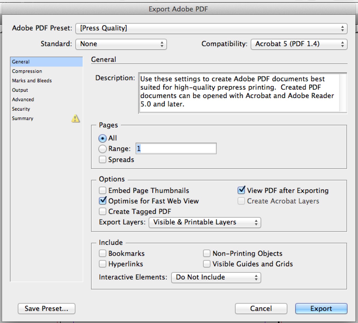
In the column on the left you’ll see the field “Marks and Bleeds” – go have a little click.
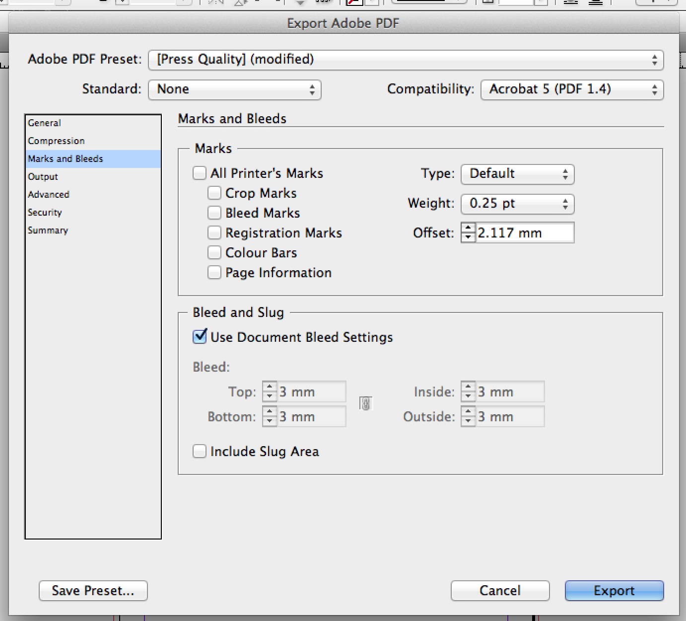
Typically that radio button next to “Use Document Bleed Settings” will be unticked. Which is dumb, because a Press Quality PDF needs bleeds. I don’t even know – take it up with Adobe. For now, make sure you’ve ticked it (don’t worry about putting any crop marks or anything on there – your printer will add their own) and then you’ll be ready to export.
Wouldn’t this be easier with videos?
Yeah, it would be, but I hate doing videos. They make me awkward and terrified.
Fine. Videos. Have some videos.
I really, really, really, hate doing videos. Never again.
A note on clearance.
If you’re working on a saddle stitched book (one with staples) then congrats. You’re done. You may now leave the seminar room. If you’re doing a perfect bound book (one with a spine) I’ll have to ask you to remain in your seats a little while.
In addition to making sure that your bleeds are right, you’re going to need to think about your clearance. Grab a paperback book from somewhere and open it at random: you’ll see that anything that goes right up to the edge of the page on the spine side is hard to look at, right? You have to really stretch the spine out for it, which results in breaking it eventually, which sucks. You’ll need to bear this in mind when setting up your artwork.
At comicprintinguk we’re a little unusual, in that we almost exclusively use PUR binding, rather than standard perfect binding. It allows for a much stronger spine, which is more durable and less likely to lose pages. PUR glue is much more adhesive than regular EVA, sets harder, and doesn’t need to be applied in such liberal quantities to make a solid spine (this, incidentally, means that we can put a spine on a book with a relatively low page count – as few as 28pp in some instances). But you get nothing for free in this world, and the pay off for a better spine is that you need a bit more clearance than on a regular perfect bound book.
When we glue the covers to your book we’ll apply a 6mm hinge – meaning that the first 6mm of the inside covers will be entirely affixed to the first page of the interiors (meaning don’t put anything in there – it’s literally impossible to see because it has glue on it). We generally suggest that you leave at least 6mm clearance on all the interior pages (this is in addition to the bleed) for anything important (again, speech bubbles, faces with important expressions, that kind of thing). Anything that’s inside this clearance zone *will* be visible, unlike the bleed, but it’ll be hard to see without stretching out the spine and making the reading experience uncomfortable, which you don’t want for your lovely readers.
6mm clearance is a minimum – I’d generally recommend working to 10mm for optimum results. This will most likely make your artwork look unbalanced on screen – closer to the edge of the page on the outside than it is on the spine side, but trust me, it’ll look right in print. You just need to get used to thinking of the first 6mm as essentially dead space…
Clearance is less of a hard and fast rule than bleed – it’s about aesthetic preference rather than technical requirement – so don’t stress about it too much. If you have a spread in your perfect bound book and don’t want to split it out that’s fine, just be aware that the bits in the middle will be lost! If you’ve got enough time before your printing is needed it might be worth getting a physical proof to make sure you’re happy with positioning and clearance (be sure to mention this when you get a quote so we can factor it in – most proofs on a digital run are about £20-25, which is usually worth it).
Right, that’s it. Bit word-salady, but there you go. Questions? Let us know.
This information has made me feel less like a monkey with dyslexia and more like a layout superhero. Thank you! I really appreciate the way that this was clearly written and loved the tone. Nice work yo!
Thanks again.
-t